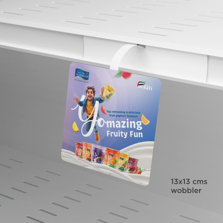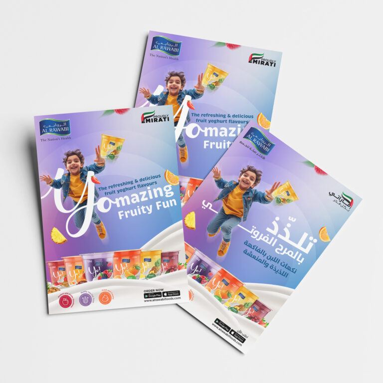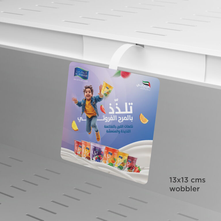
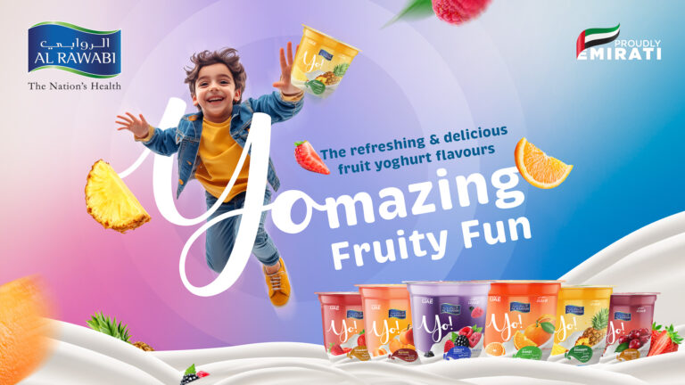



To strengthen market appeal and enhance consumer perception, we rebranded Fruit Yo! with a bold and visually captivating design that stands out on crowded shelves and surpasses competitors. While the previous packaging was familiar, it had become outdated and no longer reflected the brand’s vibrant and fresh identity. Our objective was to modernize and elevate its visual presence, ensuring it remains both engaging to consumers and relevant in the market.
Our approach focused on developing a design that is both unique and memorable. We carefully selected bold and refreshing colours, tailored to each flavour, to create a distinct identity for the product. Incorporating vivid fruit visuals emphasized the natural and fresh qualities of Fruit Yo! while creating a sense of excitement and positivity. Every element of the design, from typography to imagery, was meticulously crafted to ensure the product stood out among competitors and resonated with the target audience.
To amplify the impact of the rebranding, we developed a suite of eye-catching teasers and revealer posts with POSMs to showcase the revamped Fruit Yo! lineup across supermarkets and hypermarkets. These materials were strategically designed to ensure maximum visibility, drive consumer engagement, and solidify Fruit Yo!’s position as a standout choice on the shelves.